If you can tell your nebulae from your quasars, you will feel a special fondness for Colorverse, a high-concept line of inks out of Korea. The brand brings outer space down to earth in two ink collections: Spaceward, Season 1, has 12 colors, including Proxima B, a blue-black with hints of grey, and Sea Europa, a peaceful salmon. Astrophysics, Season 2, features 8 colors, most of which have sheen, with names like Supernova and Vortex Motion.
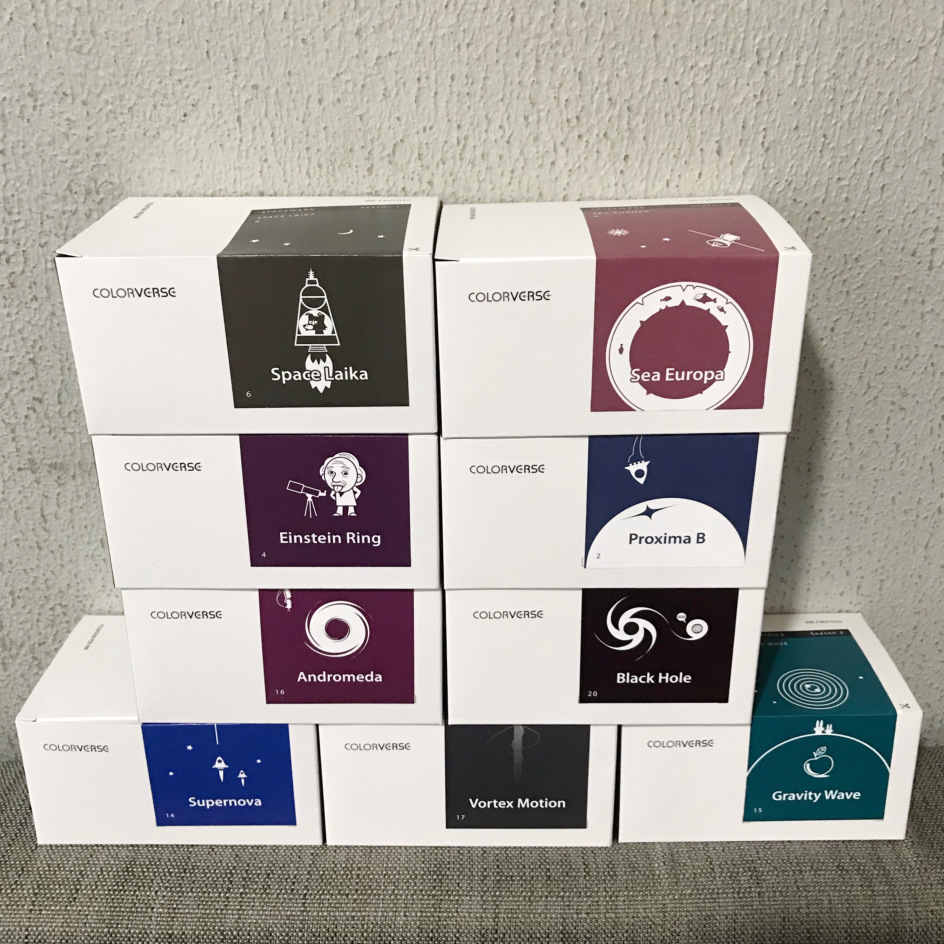
Whimsical illustrations on the packaging trigger smiles. I especially liked Black Hole, with the tiny planet’s speech bubble containing a plaintive “SOS.”
The rectangular boxes hold quite a few surprises!
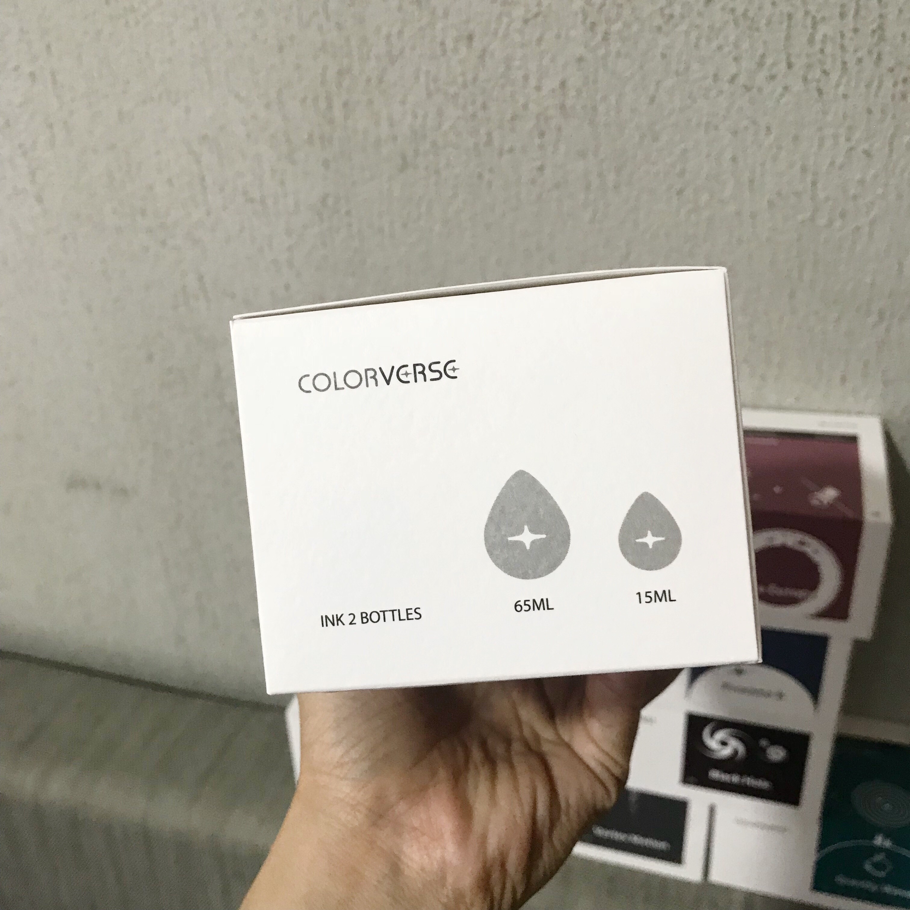
First, you get two bottles inside the box, both with a teardrop-shaped base.
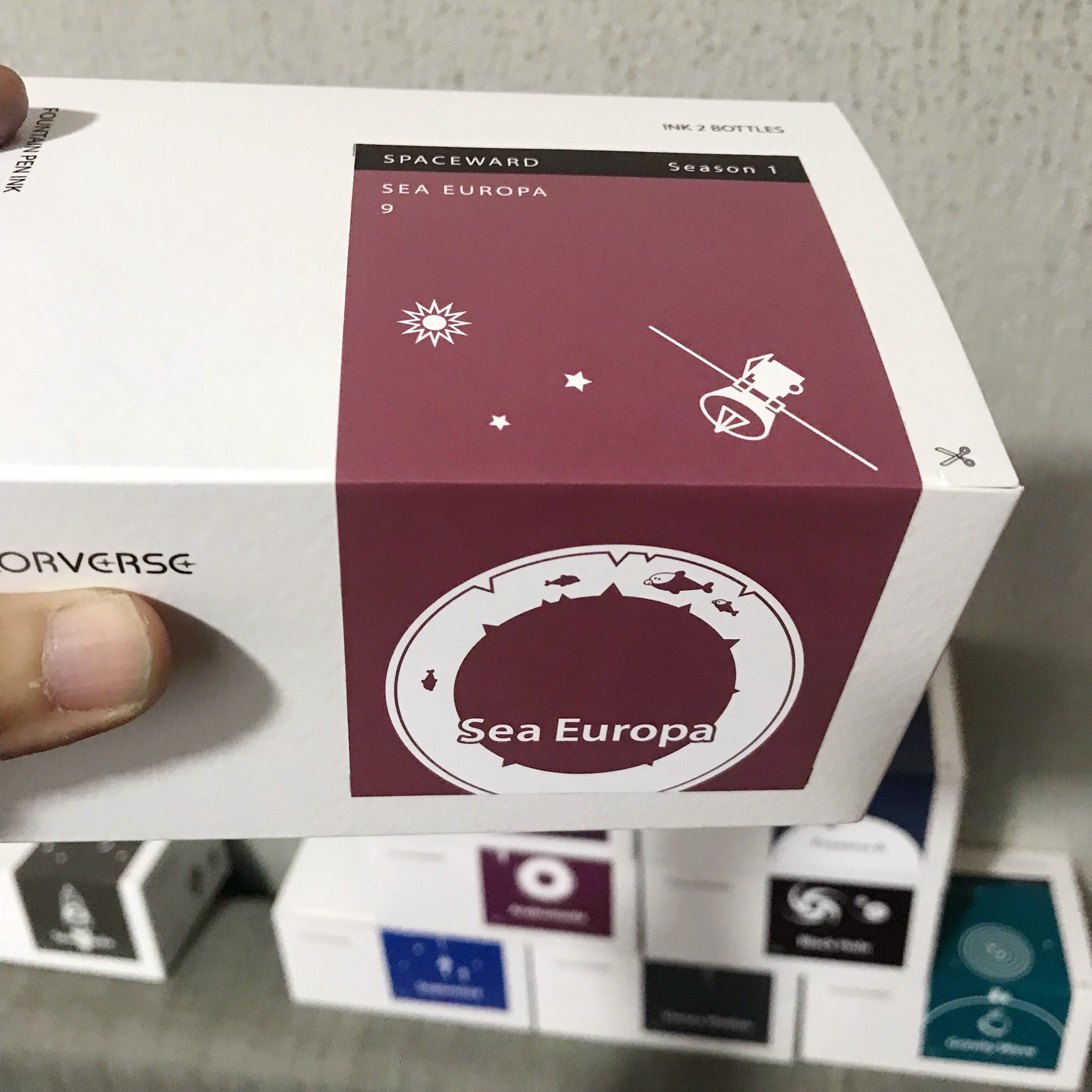
I ignored the scissor graphic telling me to cut the sticker. It peels off neatly from the base.
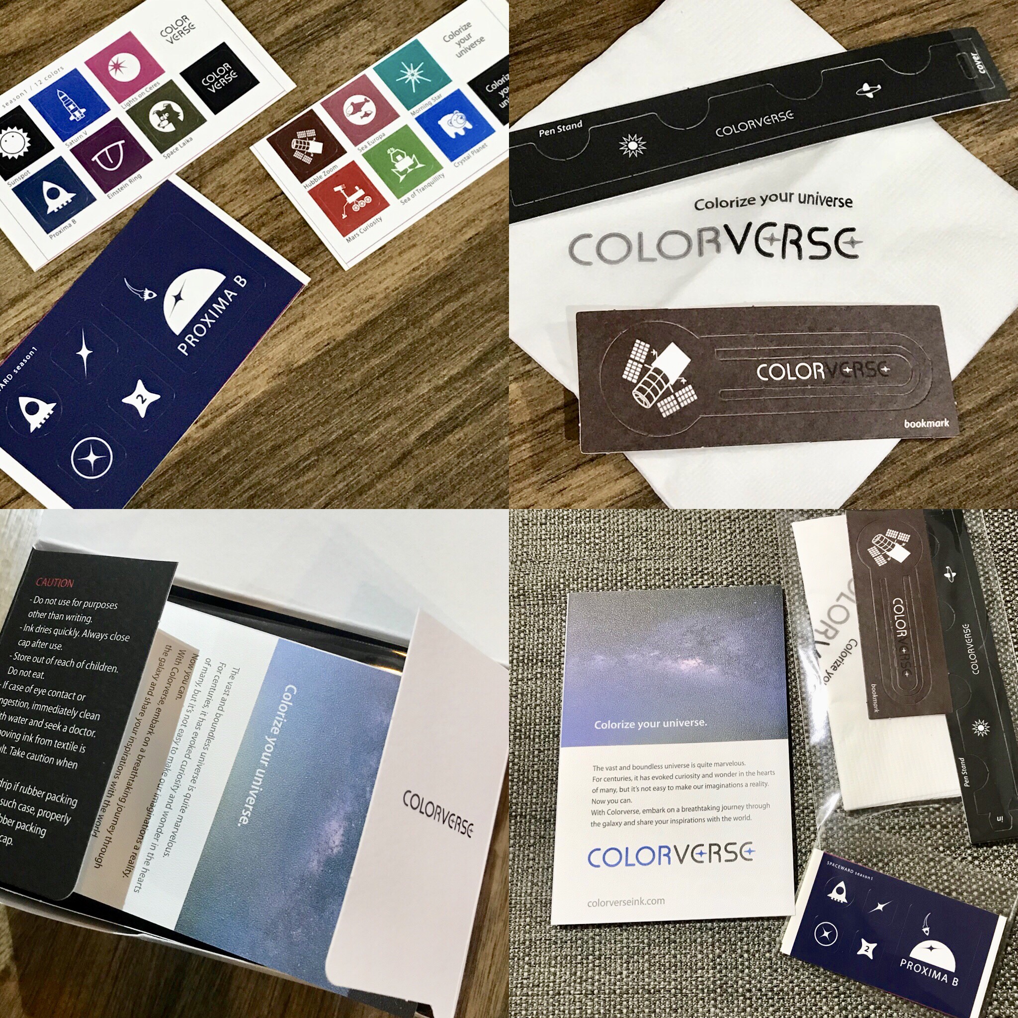
The enclosed leaflet is an ink nerd’s wet dream. Tiny, thoughtful gifts greet you before you even see the ink bottles. Stickers with the various illustrations, even a paper pen rest and bookmark, and branded tissue – for wiping your nib clean after inking.

Much thought went into the packaging details. I couldn’t help but squee at the 15 ml bottle. Perfect for Instagram-friendly travel. 😉
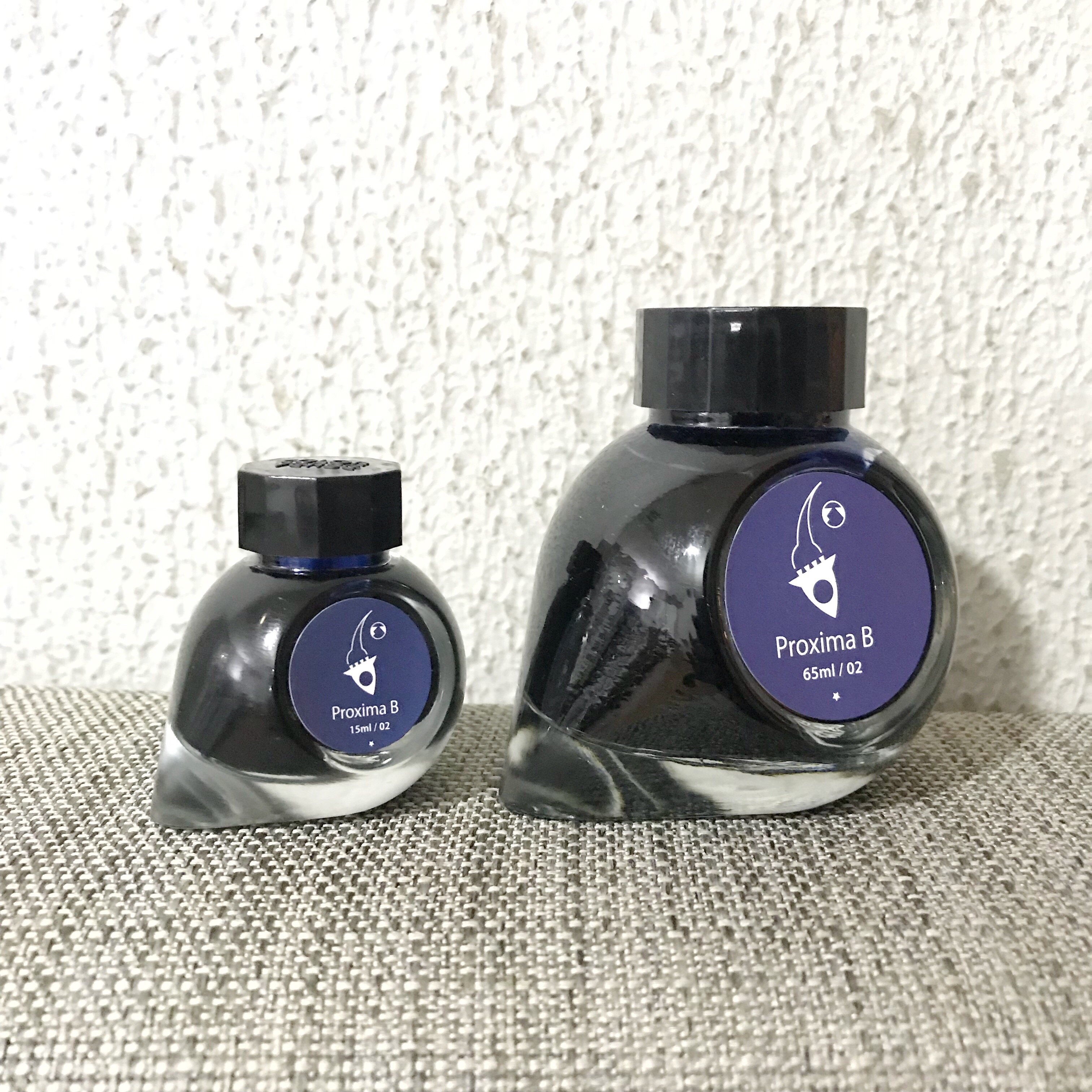
The teardrop base definitely adds display value. And did I already mention cute? Way too cute for this planet.
As befitting an exercise this nerdy, the enclosed leaflet goes into ecstatic detail about each ink, naming the RGB, hexadecimal, and Pantone equivalents of the color, plus surface tension, plus pH.
For example, Gravity Wave is RGB 2, 126,37; #007D89, Pantone 321 U, surface tension 50.0, pH 8.7.


I wanted to order everything, but not wanting to alarm Customs, I settled on a first batch of 9 inks, 4 from Spaceward and 5 from Astrophysics.
From Season 1, Spaceward: Space Laika, Proxima B, Einstein Ring, Sea Europa.

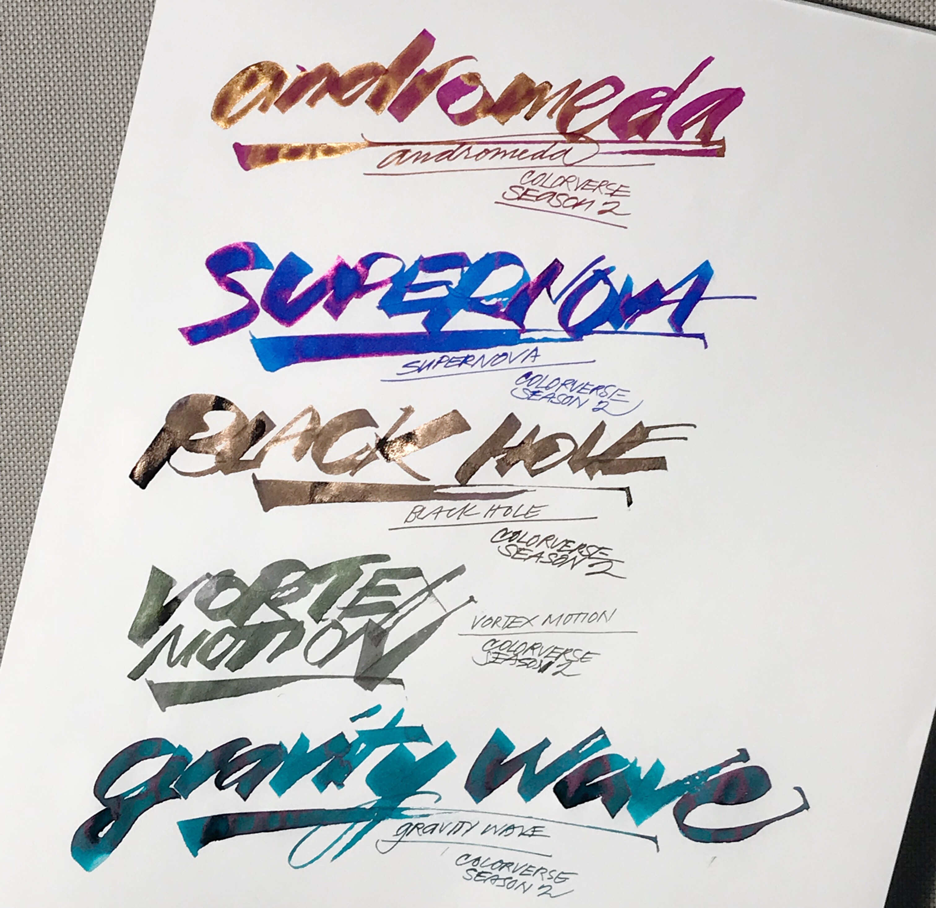
From Season 2, Astrophysics: Andromeda, Supernova, Black Hole, Vortex Motion, Gravity Wave.
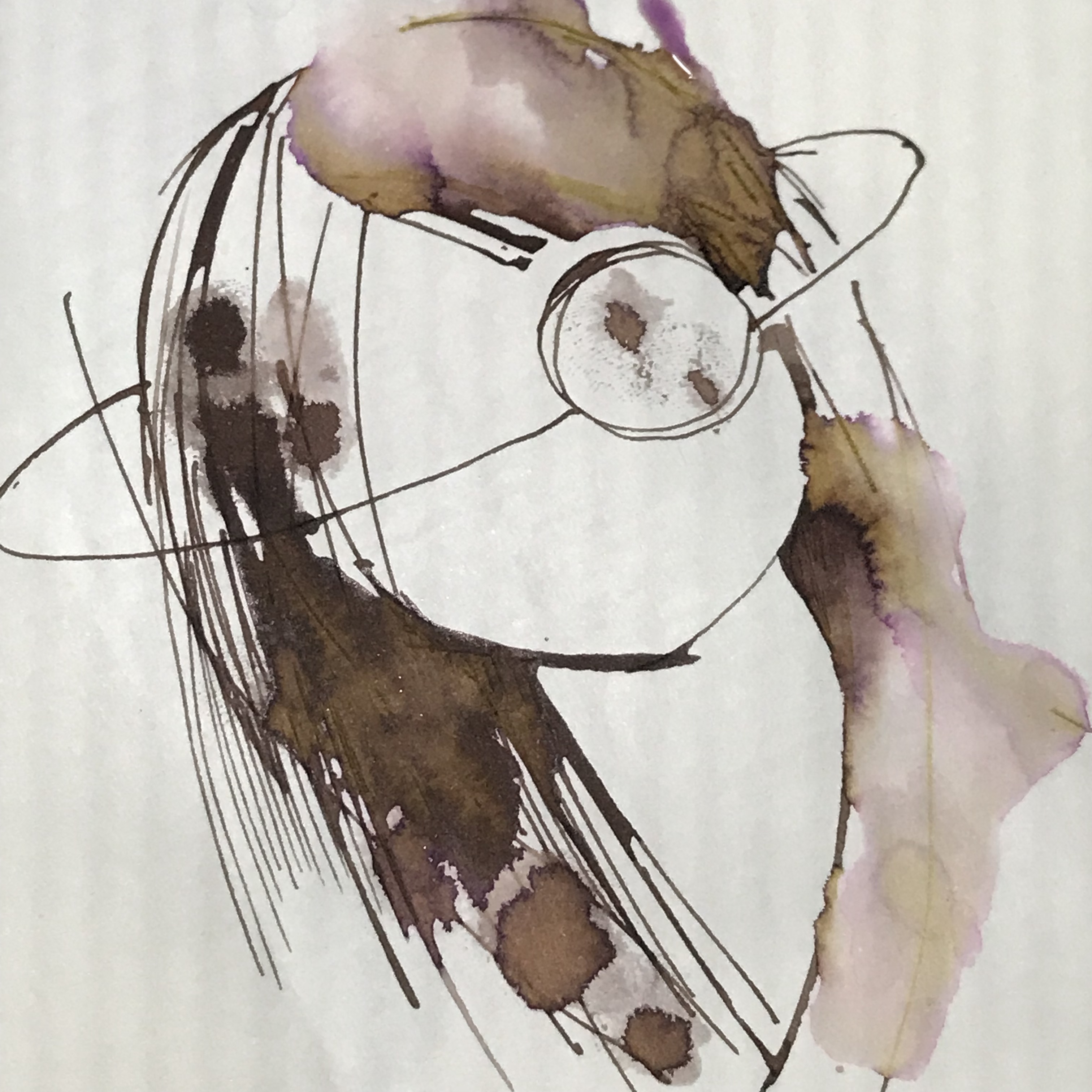
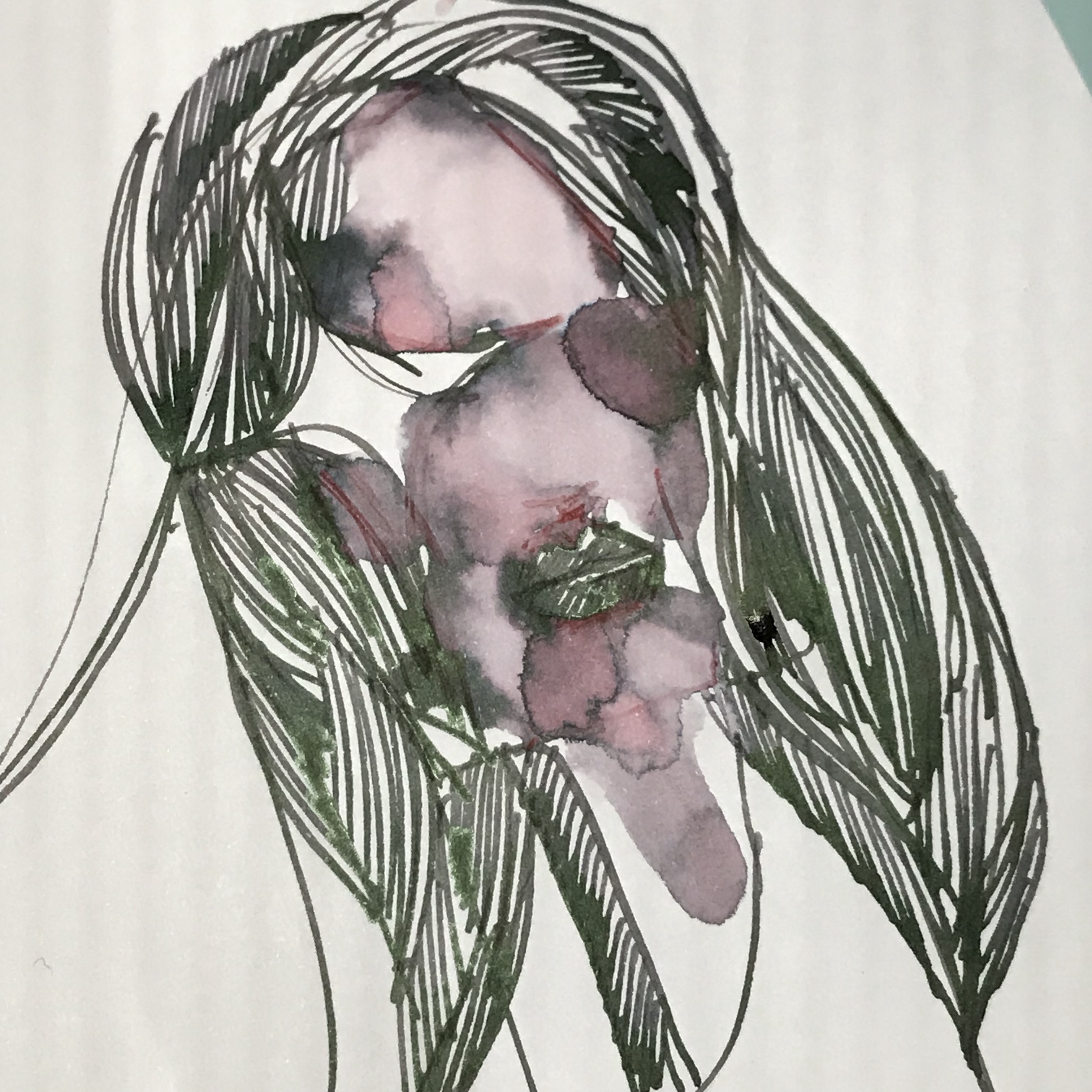
One of the things I like doing with inks is adding water when the ink is already on paper, to look for clues about its component dyes. It’s also an easy technique to cover a larger area with a wash, just like watercolor.
That’s where it gets really interesting with Colorverse. The maker’s chosen some pretty funky, unexpected combinations.
Space Laika separates into purple and ochre.
Vortex Motion, which reads as a deep grey with green sheen, has a surprising dose of violet. It reminds me of Moonglow (in the Daniel Smith watercolor world.)
So, is there a downside to all this cosmic ink happiness?
At first glance, the list price of $30 seems a little steep, plus shipping. Iroshizuku ink works out to around 40 cents per ml (50 ml for around USD20), and many consider it pricey. Colorverse comes in 2 bottles (65 ml + 15 ml = 80 ml), and works out to 37.5 cents per ml. Plus stickers. And 15 ml teardrop bottle would add so much priceless cuteness to a journaling shot. Shipping depends on where you are. So, not bad at all.
Are there equivalents in other brands? I’d think so. Andromeda is pretty close to Iroshizuku yama-budo. If you have Robert Oster Fire & Ice, it’s not that far from Gravity Wave. Still, there’s enough uniqueness in the mix. Supernova manages an almost Baystate Blue chroma with fuchsia sheen. I can’t wait to use Space Laika and Sea Europa more in drawings – they lend so much unexpected character.
These are first impressions and I’ll update this post as I use these inks more often in pens. In the meantime, if you want to peek at the entire range, head over to colorverseink.com. You can also find them on Instagram as @colorverse.ink.